The other week, I chatted with the fabulous Liz Starin and picked her aesthetically-enabled brain about fonts and layouts for websites. Below is some stuff I learned from our design adventures, both wisdom straight from her and stuff I picked up from my experience overhauling fonts and layout:
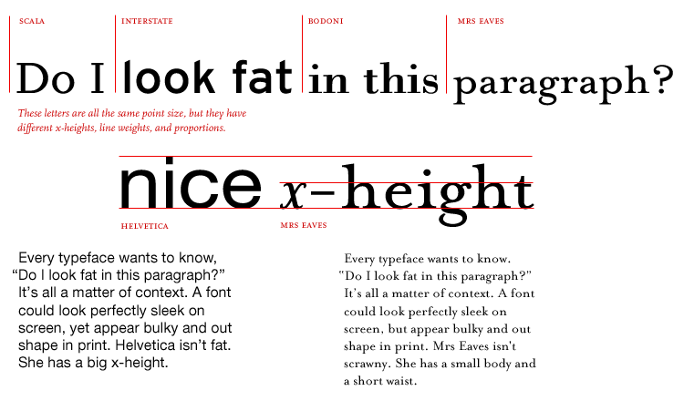
- x-height is a unit referring to how tall the letter ‘x’ is in a given font. The larger the x-height, the easier to read on-screen. (Some fonts with small x-heights include Garamond and Futura.)
 Graphic found in PAPress’s Thinking with Type project.
- serifs are generally the best choice for body text—they tend to be more readable on-screen.
- in CSS, you can set
line-height, which controls the space between lines of text. Increasing line spacing just a bit can improve readability a lot. - when picking a font, it’s helpful to have some adjectives in mind, rather than blindly scanning around for a font that you like. At the very least, it will give you a place to start.
- Google Fonts is an incredible thing.
- a surprisingly good way to gauge whether a font has the intended effect: imagine you got a wedding invitation written in that font, and think of what that invitation would say about the people getting married. Is that the image you want your website/blog/pony-rental business to convey?
- rounded fonts tend to be more playful. Or is it that playful fonts tend to be more rounded? In any case, if you’re looking for something with a “playful” vibe (like I was), rounded-ness is a good feature to start looking for.
- you can achieve a lot of variety with the same font. (In fact, you WANT to achieve a lot of variety with the same font—if no variety, your site looks boring, and if variety achieved by different fonts, your site looks like it got sloppy-drunk and made a bunch of poor decisions at the font bar.) Some ways to achieve variety within the same font: varying font weight (CSS:
font-weight), case (upper/lower/title—CSS:text-transform), and letter spacing (CSS:letter-spacing), to name a few. - I had (and still have) massive struggles with making favicons that look like anything besides a blob. A feature I hadn’t consciously thought to look at was light/dark contrast. As a quick way of checking, Liz suggests putting the image in grayscale and seeing if it looks decent like that.
- some fonting resources: A List Apart and Smashing Magazine