(Cross-posted from Windmill’s blog.)
At the end of April, Windmill (all five of us) trekked down to GothamGo to learn things, meet people, and pitch our product. As Silver Level sponsors, we had our very own little table on the first floor; it was the perfect chance to pitch our fledgling product, make connections, and figure out what developers might want from us. The only question was: how?
We’re a brand-new team, and GothamGo was a great excuse to do some important work. In preparation for the conference, we talked, we brainstormed, we aligned on our values and objectives and product goals; and then took the results of those conversations and ran with them, building our booth and our pitch from the bottom up.
The Booth (Objectives and Values)
The first order of business was: what was our booth going to look like? We asked this question of the team, and immediately realized that we first had to tackle our zeroth order of business: what were our objectives for the conference? In other words, what did we as a company hope to get out of GothamGo? Our answers would shape how we interacted with attendees, and how we decked out our booth to encourage those interactions.
We decided that the primary things we were looking to get out of this conference were:
- A pulse on developer needs. (What are the pain points of people’s current dev tools? What do they want their magic dev tools solution to do for them?)
- Product feedback. (Is our current incarnation of Windmill the right product to be building?)
- Design partners. (These are larger organizations interested in adopting Windmill for their codebase, who will work with us to refine our product for them — and by extension, for other users.)
Additionally, though not our primary focus, nice-to-have conference benefits included:
- Buzz around our product
- Alpha users who would play with Windmill and give us feedback
- Rad developers interested in joining our team
With a framework in mind, we then turned to booth design.
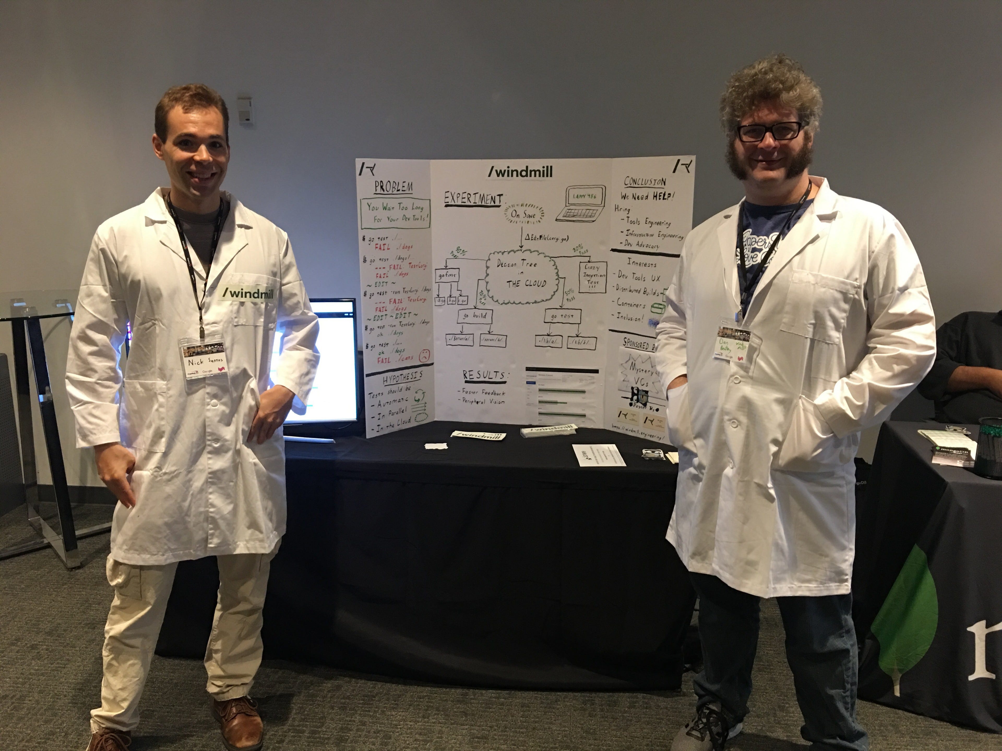
Last year at GothamGo, our founders went full science fair, with great success.

Nick and Dan at GothamGo ‘17
This year we wanted something with a similar vibe — not a big fancy banner with our company name on it, but something more personal and more interesting.
Instead of throwing ideas out into the void, though, we decided to focus our thinking. What did we like about last year’s booth that we were trying to replicate? What did we want this year’s booth to communicate? We brainstormed, and came up with some values that we wanted our booth to reflect:
- DIY (“we got our hands dirty making this booth instead of just buying a pretty banner”)
- Authentic (“we’re being our excitable, nerdy selves and we’re really psyched about dev tools, y’all!”)
- Approachable
- Sparks conversation
- Communicates the stage of our startup (i.e. early. Very early.)
- Empathetic
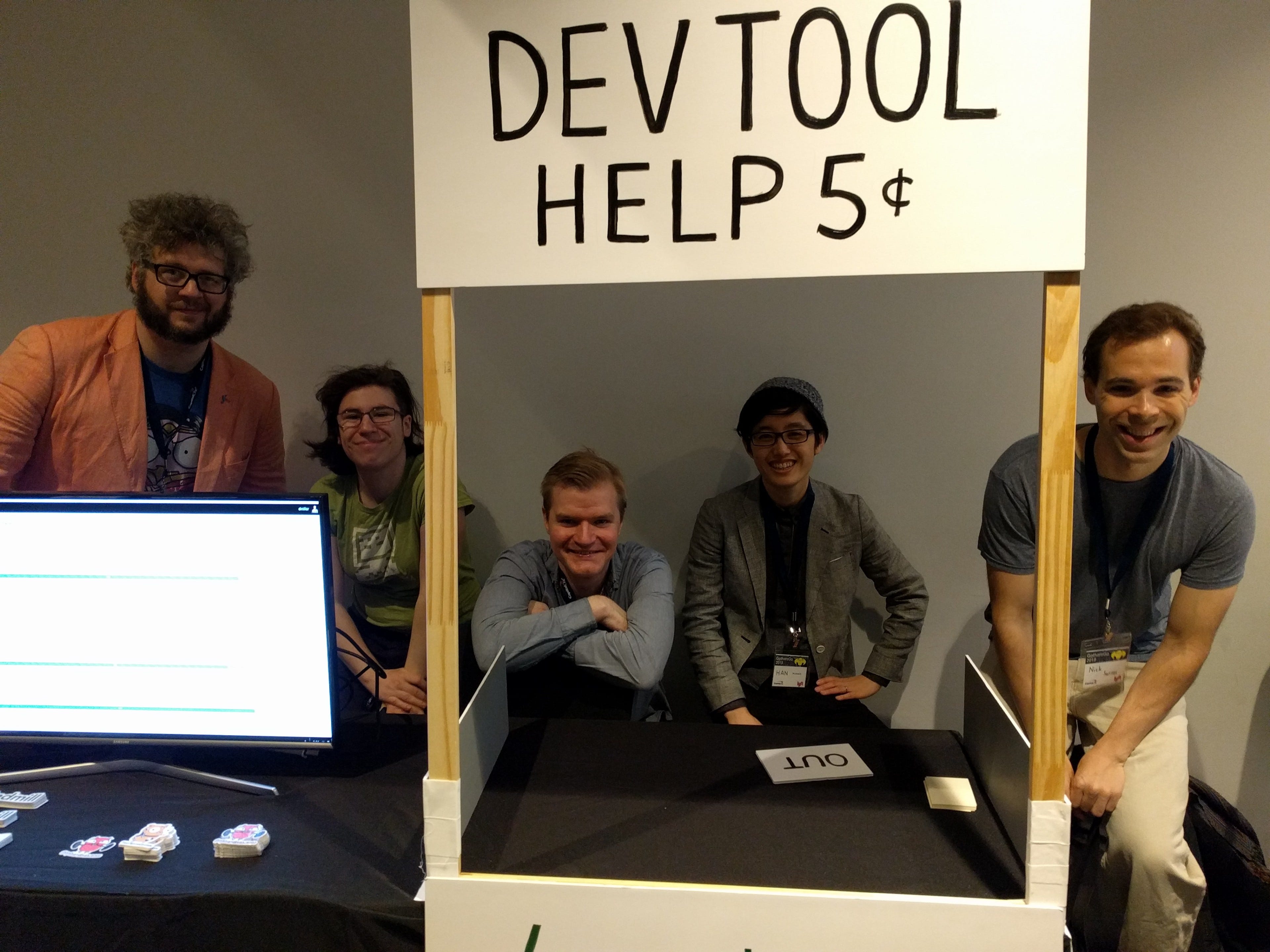
We started tossing out ideas for booth themes in keeping with these values, but the breakthrough actually came when we took a slightly different tack: rather than “what do we want our booth to be,” we considered, “how do we want our booth to hook passersby?” The very first idea that got proposed was: “let’s let people complain about their dev tools. People love complaining about their dev tools.” The team loved it, and from there, it was jut a hop, skip, and a jump to Lucy’s “Psychiatric Help 5¢” stall from Peanuts.

The final product!
We spent some time spitballing ideas, and declared a sub-committee to come up with a more concrete proposal. (It turned out that this was a key move — brainstorming is great for generating high-level ideas, but trying to make specific decisions in a committee of 5+ is a recipe for disaster.) With the fruits of this meeting in mind, our sub-committee set out to decide exactly what the booth would look like, and what swag/shiny things/interactive bits we would have to spark conversation and move towards our objectives.
Keeping It Lean
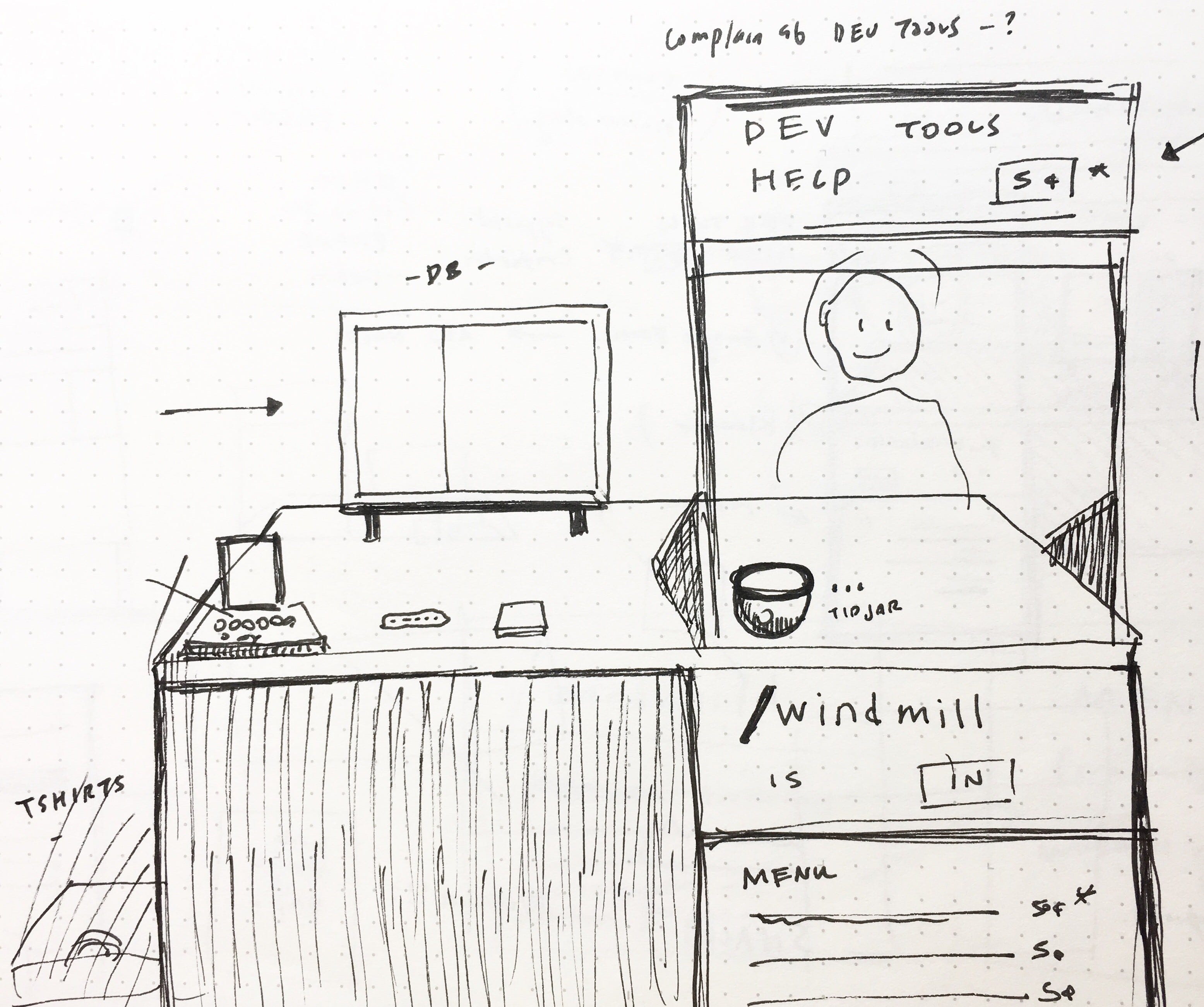
Our sub-committee brought back a booth proposal with a bunch of neat stuff, including:
- a “tip jar” where people could optionally put their 5¢ for donation to Women Who Go
- a monitor with a screencast of our alpha product in use
- a “make your own T-shirt” station
- an iPad and keyboard for folks to fill out a contact form (okay, maybe this one is par for the course)
…and more! In the end though, we decided to strike almost all of their proposals.

The initial booth proposal. Note a handful of things already crossed out.
Any of the things suggested would be great booth components and conversation starters in their own right; but all together, it was just too much! If someone came up to our booth, we didn’t want to overwhelm them with choice; instead, we wanted a booth that funneled visitors into our desired modes of interaction. In the end, we opted to keep our booth lean, with only three major components: the psychiatry booth sign itself (“Dev Tools Help 5¢”); the screencast of Windmill Alpha in action; and a handout asking people for dev tools horror stories and directing them to our contact form.
The Pitch
The product we’re trying to build is a little new and a little amorphous. Given that, and the fact that 40% of our team had joined within the previous months, we took GothamGo as an opportunity to align on our vision of Windmill and to practice pitching our product.
To kick off our practice session, our co-founders (by far our most experienced pitches) shared some of their one-sentence product hooks. (We don’t have a clean-cut “Windmill is like {Uber} for {cats}”, but there are a handful of pithy phrases that work well to explain our product and spur further conversation.) Armed with these one-liners, we all role-played pitching Windmill to a conference attendee, with the rest of the team giving feedback. Here are some useful guideposts that emerged from this exercise:
-
Your opening line can be brief. I had previously bent over backwards trying to explain Windmill in one sentence, but to my surprise, the best pitch-starters were the shortest: say, “Windmill makes development tools that give you faster answers to better questions.” The purpose of the opening line was not to explain our entire product in one go; it was to catch interest and spark discussion.
-
Let the pitch-ee steer the pitch. If you’re talking to a real containers nerd, of course you want to seize the opportunity to brag about your container magic. And conversely, if you’re talking to someone whose biggest pain point is iOS integration testing, if you spend 5 minutes talking to them about deploying to Kubernetes, you’re wasting their time. However, if you take their signals and talk about the things they seem most interested in, you hold their interest better and have a greater chance of getting their buy-in. And in order to customize your pitch, you probably want to…
-
Ask your pitch-ee questions about their situation/use case. This is by far the best way to make sure you’re pitching to someone and holding their interest, instead of rambling about generic stuff that’s not of interest to them.
-
Corollary point: probe to get at their concerns and reservations, and address them directly. If you’re feeling resistance to your pitch, figure out *why — *either you can address your pitch-ee’s concerns and explain how your product is in fact right for them, or you come away with a new growth area for your product.
We came away from our practice session more comfortable in our pitch, and more unified in our product vision. And because of our thorough prep work — for pitch, booth, and conference objectives alike — we were able to go into GothamGo prepared, aligned, and ready to make some new friends on behalf of Windmill.
Want to see the fruits of our pitch-practicing? Luckily, it’s easy to get a first-hand demonstration: hit us up at @windmill_eng or drop us an email!
Thanks to Sarah Withee and Rae Krantz for their feedback on this post!